Introducing Informed, a U.S. civics and political data tracker for iOS
June 2, 2026
Introduction
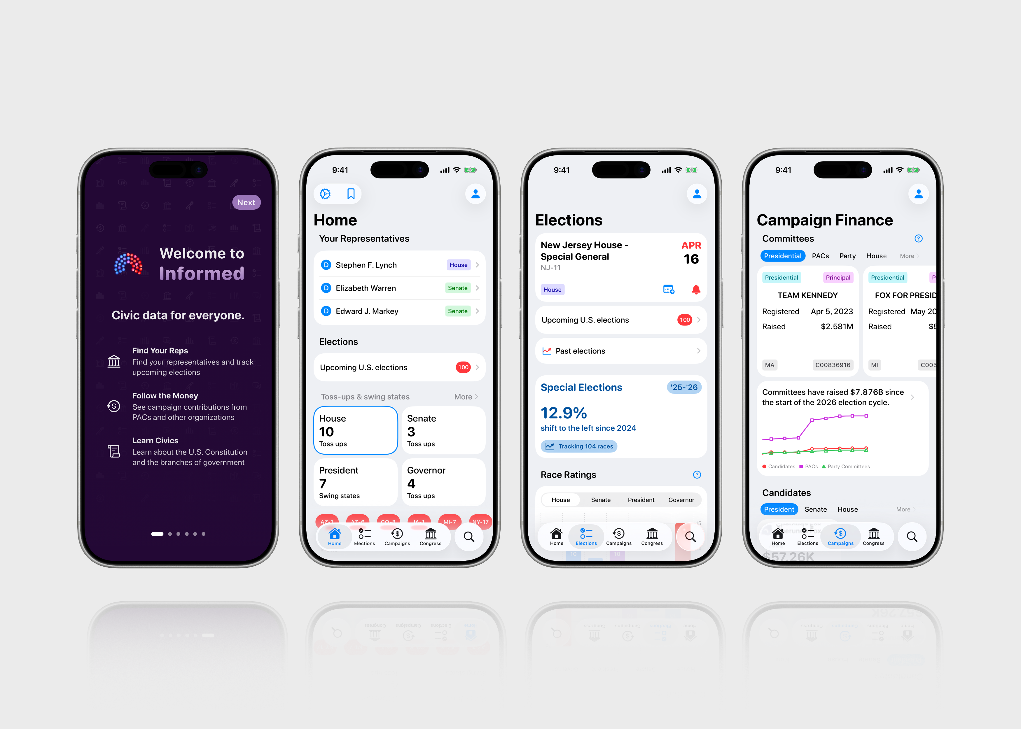
Informed is an iOS app that helps people better understand and track civic and political data for elections, campaign finance, candidates, members of Congress, and polls. The app allows users to quickly discover upcoming elections, find and contact their representatives, browse the political action committees funding candidates, and so much more. Informed also includes educational guides to make learning civics easy and approachable, covering fundamental concepts such as the structure of the federal government, elections and voting, state and local government, and citizenship and civic discourse. My goal is for Informed to be a comprehensive, accurate, and non-partisan source of information for anyone interested in following civic data and learning more about the civic and political environment of the U.S. The app's motto, "Civic data for everyone," reflects my aim to make that information approachable, transparent, and easy to understand.
Informed adds data-driven context to today's electoral landscape. When you come across a candidate for an open House seat on social media, rather than (or in addition to) going to Google, you can use Informed to quickly see how much money they’ve raised, how left- or right-leaning their district is, and the date of their next election. When you hear about a competitive swing district, you can easily find its Baseline and Cook PVI, two metrics that measure partisanship, as well as who currently represents it.
Informed features a clean, intuitive, and easy-to-navigate user interface that is meant to feel right at home on iOS. The app relies on native Apple design components to prioritize the display of different kinds of data, such as campaign finance numbers, political parties, election results, and committee types. Making this data accessible and intuitive is one of my main considerations when determining the layout of each view. The app’s UI is largely made up of list and card-like components, similar to the Wallet, Health, or Reminders apps. The use of bright colors and a medium font weight throughout ensure that these elements are easy to read and distinguish.
The app's icon features a simplified parliament chart, which is commonly used to visualize the partisan breakdown of legislative bodies like Congress or the UK's Parliament. The app's color palette uses red and blue to represent the two major political parties in the U.S. (red for Republicans, blue for Democrats), while purple often represents bipartisanship, centrism, or moderation, though here it's also used to illustrate the fact that not everyone may fit neatly into either party.

Open civic data is at the heart of Informed. When its first opened, the app fetches data from a number of publicly accessible sources, including the FEC, to populate it with the most notable candidates and committees (i.e., those who have raised the most money in the current election cycle), current Congress members, upcoming elections, and more.
The Home tab is the central hub of the app, where users can quickly access information on elections, race ratings, campaign finance, and civics guides as well as bookmarks, app settings, and their user profile. The settings include a few fun customization options, including alternative app icons, light & dark mode, and a selection of accent colors. You can also choose which browser you want to open links in as well as grant permission for notifications (and if you've added your district, turning on notifications will automatically schedule them for your upcoming elections). You can also find additional information about the app itself, such as the data sources and APIs that power Informed, the open source code I use, and a tip jar for users who want to support the app’s independent development.
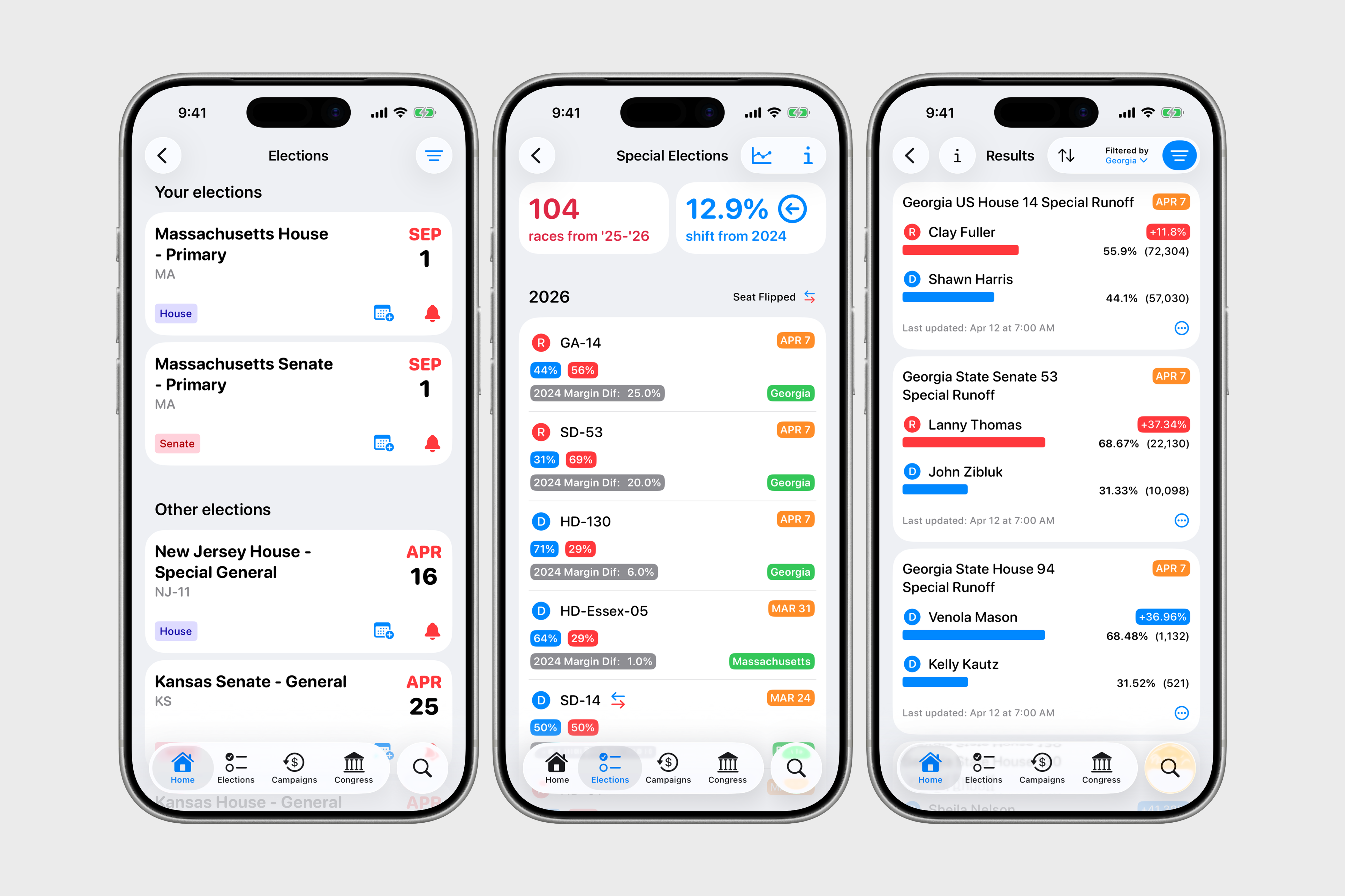
Upcoming elections
Showing upcoming elections—and helping users better understand the candidates and finances associated with them—is a cornerstone of Informed. By default, the app shows all federal elections, minus those in U.S. territories and party conventions. Users can quickly see their upcoming elections, set notifications, and add the election to the Calendar and Reminders apps. They can also learn about the candidates running for a particular seat and how much money they’ve raised. Eventually, I would like to provide more detailed election data that includes voter ID laws, registration deadlines, polling locations and hours, sample ballots, ballot measures, candidate websites, and more; however, this kind of data is much more expensive and isn’t included in the app at this time.
Live election results (in development)
Informed also offers no-frills federal, state, and local results on election night, updated every minute. When polls close and results start rolling in, users will typically see a banner at the top of the Home tab, indicating that there are now live results they can view. There may be hundreds or thousands of elections being tracked, so users can filter by office, election type, and state as well as sort by date, vote count, and vote margin. There are still design improvements and additional features I'd like to implement, but a lot of work has already been done behind the scenes so far. It provides a solid foundation built on open data (the results are fetched from civicapi.org) for those seeking simple, on-the-go election updates.
Special elections
Outside of midterm and presidential elections, one of the primary ways to understand the electoral landscape is through special elections, which are unscheduled elections triggered by a vacancy in an elected office. We can compare special election results to the previous presidential election, noting overall trends when averaged across dozens of elections to get a sense of how voters are responding to the national political climate. This approach was pioneered by The Downballot, and their public data is used to show results for all special elections as well as the average margin shift compared to the most recent presidential election.
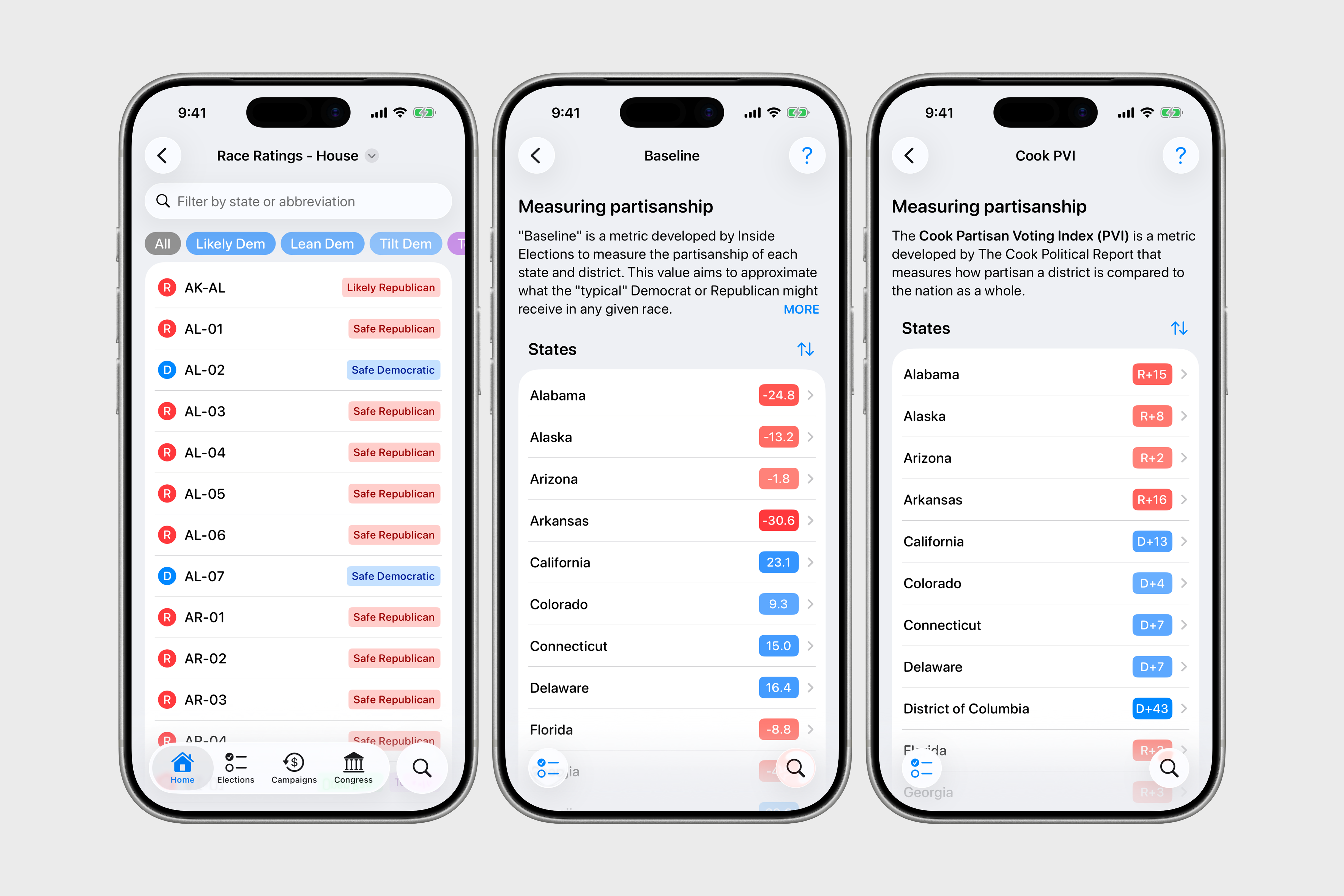
Race ratings & partisanship
In addition to showing upcoming elections, the app also has ratings for races that indicate how competitive an election is. Race ratings are sourced from Inside Elections, which provides nonpartisan analysis of campaigns for the Senate, House, governors, and president. The ratings are:
- safe Democratic and safe Republican: As of today, the party indicated is all but certain to win the seat.
- likely Democratic and likely Republican: One candidate has a substantial advantage, but an upset is still possible.
- lean Democratic and lean Republican: The party indicated has the edge, but the outcome is less certain than for races rated as likely.
- tilt Democratic and tilt Republican: The outcome is effectively regarded as a toss-up for each of these highly competitive seats, although the party indicated has a slight edge.
- toss up: Neither party has an edge in these contests.
Informed also flags open races (which occur when the incumbent is not running for re-election). These ratings are meant to help you quickly identify the most competitive elections and better understand the distribution of races across the different ratings. Whether a race is a toss up or safe seat can help provide additional context as to whether opponents have a realistic chance of winning or help us better understand the political calculations that a representative might make in Congress.
Lastly, Informed provides two metrics that measure partisanship: Baseline (from Inside Elections) and Cook PVI (from The Cook Political Report). Baseline aims to measure the vote share that a “typical” Democrat or Republican might receive in any given race, and we can use the difference between the Democratic and Republican Baselines to measure whether a district leans left or right. According to Insider Elections, Baseline “captures a congressional district’s political performance by combining all federal and state election results over the past four election cycles into a single score”:
“What makes Baseline different from some of the other metrics out there is its depth. Most references to competitiveness focus on the margin in the most recent congressional election or the most recent presidential result in the district. It’s also common for other major statewide results, such as Senate and governor, to be broken down by district, especially when those races are competitive.
But Baseline—by design—requires more. Along with the offices listed above, Baseline includes all statewide elections for executive and constitutional offices, from the common (lieutenant governor, attorney general, secretary of state, treasurer, auditor) to the obscure (including mine inspector in Arizona and railroad commissioner in Texas).”
You can read more about Inside Elections’ methodology for Baseline here and here.
The Cook PVI, by contrast, is calculated by looking at how each district voted in the past two presidential elections relative to the national popular vote share for those elections. A Cook PVI score of D+3, for example, means that in the 2020 and 2024 presidential elections, that district was three points more Democratic than the nation as a whole, while a score of R+2 means the district was two points more Republican.
Combined, these ratings and metrics provide additional guidance when looking at an election or district; in the 2024 cycle, for instance, you might have come across a Democratic candidate running for Utah’s open Senate seat (previously occupied by Mitt Romney, who retired), but the seat’s safe Republican rating indicated the candidate was likely to lose (and a win would have been a substantial upset relative to expectations). Or maybe it’s Election Day and you’re overwhelmed by the number of results coming in, but focusing your attention on races rated as toss ups can help indicate whether one party is performing better than expected in highly competitive districts.
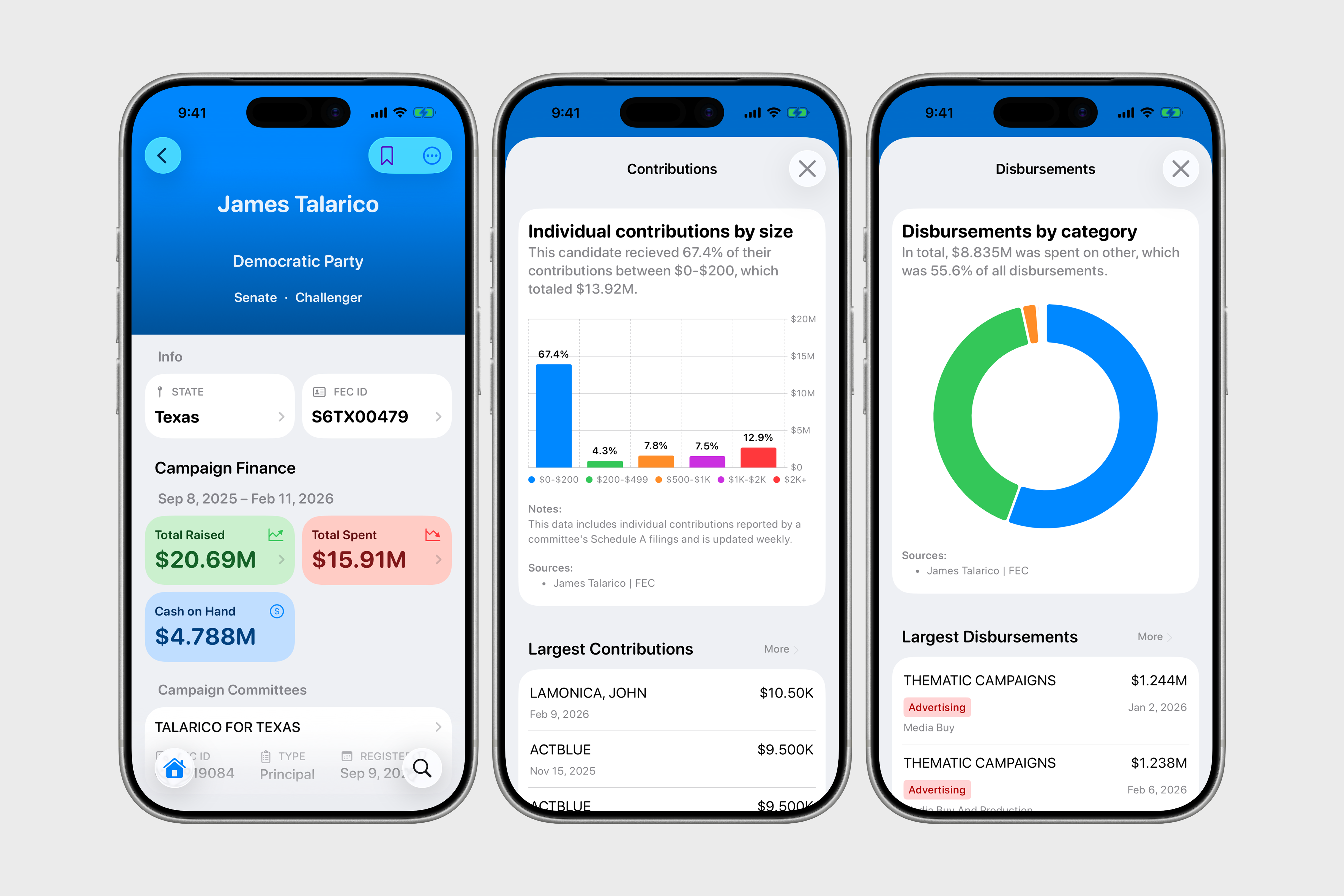
Campaign finance
Campaign finance in the U.S. is a complex subject, and part of the difficulty of building Informed is in both displaying campaign finance data in an intuitive and helpful way while also giving people the context to actually interpret that data correctly. Building out this section of the app required me to improve my own understanding of campaign finance, including learning the legal definitions of the different types of committees, the forms required by the FEC, notable court cases influencing campaign finance law, and the many endpoints of the OpenFEC API. The FEC site was extremely helpful in this regard, and I recommend anyone who wants to explore this kind of data in depth start there.
Campaign finance plays a large role in Informed, and my overarching goal is to draw attention to not only the influence of money in our political system but also show how that money flows between nonprofits, committees, and candidates. That data is already public and freely available (see the FEC site and OpenSecrets, for example), but it may not be immediately apparent or obvious to voters making a decision at the ballot box. Informed puts this data front and center in a clean, navigable interface.
Informed’s use of the FEC’s campaign finance data is also a great opportunity to leverage Apple's Charts framework to visualize this information in a colorful way. The app includes several finance-related charts, two of which show the total amount of money different committee types have raised in the current election cycle (which, in 2024, totaled nearly $25 billion by Election Day) and how much money presidential, Senate, and House candidates have raised, broken down by party. Both illustrate the astounding scale of money that is spent each election cycle to influence voters and boost campaigns. Users can, of course, dive further into this data, looking at contributions and distributions for individual candidates and committees. In the future, I hope to add more granular details, such as FEC filings.
One limitation of the FEC API is that it doesn’t really give any general background information about particular committees, except, occasionally, the committee website. Committees can have vague or confusing names and it may not be clear which party or candidate they’re associated with. Normally, if someone wanted to learn more about, say, Never Back Down, the super PAC that supported Ron DeSantis’s presidential campaign in the 2024 cycle, they would have to leave Informed, do a Google search, and read a few articles—or, more frequently these days, go straight to an LLM-based chatbot. In my experience, LLMs with search functionality can rapidly speed up this part of the campaign finance research process, and I've experimented a little with using generative AI to synthesize news and information about particular candidates or committees, but for a number of reasons, I don't currently plan to implement any AI-based features in Informed.
Add your district
After initially downloading the app, users will see an option to add their district at the top of the screen. Knowing the user’s address or congressional district allows Informed to find their representatives in Congress as well as show their upcoming elections and related campaign finance data. Informed implements this feature with a priority on privacy, giving users the option to type in their residential address or, if they prefer, give an approximate location by selecting their state, county, and congressional district from a drop-down menu. Privacy-conscious users can also enter a nearby residential address, such as a neighbor’s (though there’s a small chance this will lead to incorrect data). Addresses are used in one third-party API (Geocodio) but is not associated with the user’s identity, is not sold to third parties, is not known to Informed’s developer, and can be deleted at any time.
The user’s profile, which can be accessed from the navigation bar, displays all of this personalized information in one place, including their district’s race rating (as determined by Inside Elections), Cook PVI, and Baseline, all indicating whether the district leans left or right.
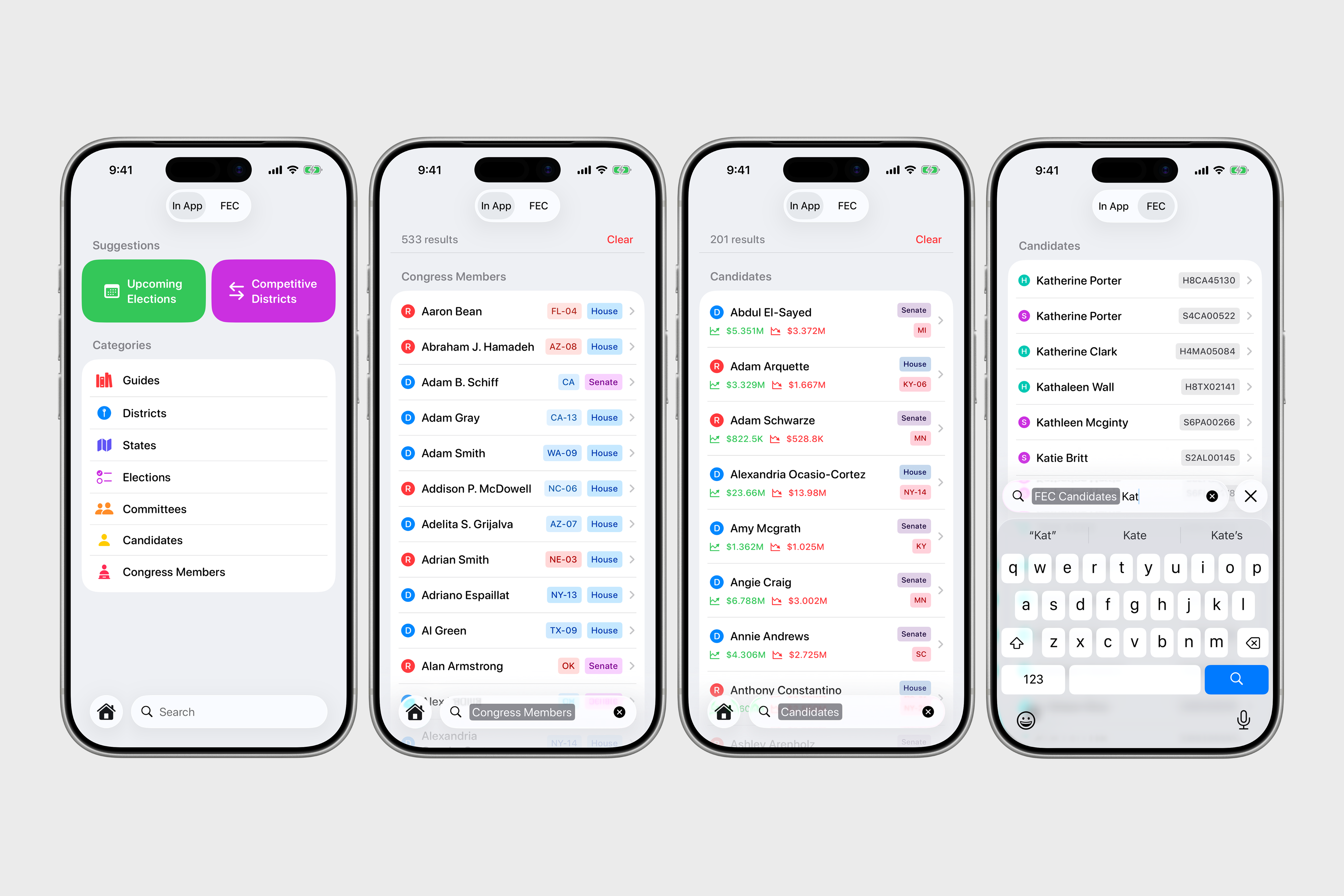
Universal search
Searching in Informed is powerful, fast, and flexible. Users can search in-app across a range of categories—districts, states, candidates, committees, elections, Congress members, and guides—for the quickest route to their destination or search the FEC database for lesser-known candidates and committees. Any search result the user navigates to is cached in the app and added to the search history for easier navigation to repeat queries. Common-sense search suggestions like states or congressional districts are built in, but users are also prompted with richer suggestions like "upcoming elections" (those in the next 30 days) or "competitive districts" (those that are considered toss-ups).
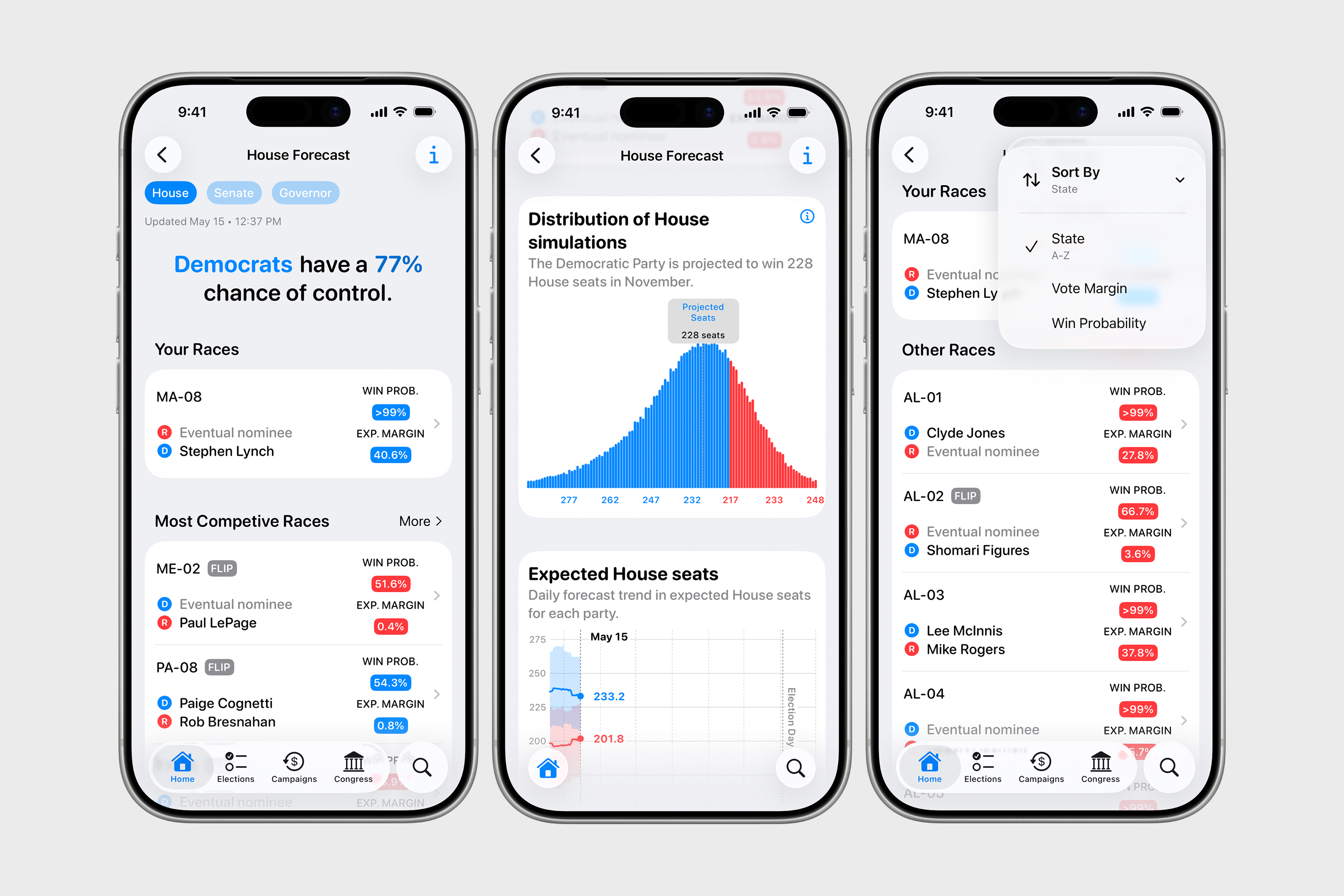
Election forecast
During election years, the app provides an election forecast powered by VoteHub, showing the chances of various outcomes for control of Congress and individual elections across Senate, House, and governors’ races, updated daily. This data helps give a clearer understanding of the current electoral environment as people navigate primary season.
Congress
While most of Informed is focused on campaign finance and election data, the app also shows current members of Congress, along with some biographical and contact information. At launch, this section will be limited, but with a lot of potential to include bills, amendments to bills, and sponsored legislation with help from the Congress.gov API.
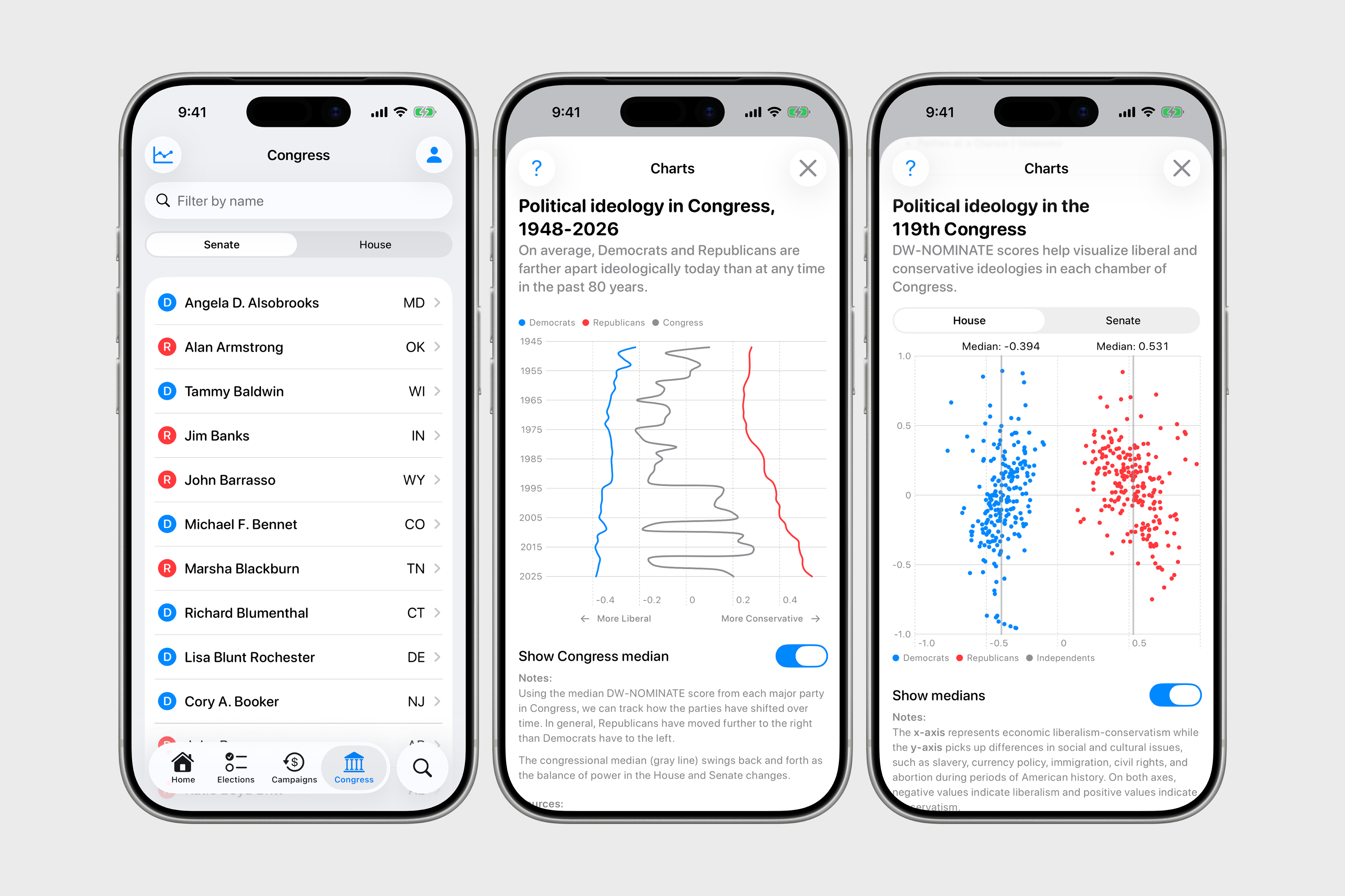
There are two charts in this section worth describing in more detail though. We can measure the political ideology of Congress and individual members using a statistical method called DW-NOMINATE, or dynamic weighted nominal three-step estimation. Developed by Keith T. Poole and Howard Rosenthal in the 1980s, it places each legislator on a two-dimensional ideological scale, with the first dimension representing the traditional liberal-conservative economic spectrum (from -1 for most liberal to 1 for most conservative) and the second dimension capturing differences in social and cultural issues, such as slavery, currency policy, immigration, civil rights, and abortion. Since about 2000, the second dimension has become less significant to the point where "almost every issue is voted along 'liberal-conservative' lines." DW-NOMINATE scores are designed to be comparable across different Congresses, allowing researchers to track how the ideological positions of individual legislators, parties, and the entire Congress have evolved. The method has become a widely used tool in political science research to quantify polarization and study voting patterns in the U.S.
DW-NOMINATE data going back centuries is available at voteview.com, and Informed includes two charts that show (1) the ideological shift of Congress over the past 80 years and (2) the ideological makeup of the House and Senate in the 119th Congress. Perhaps the first chart's most striking feature is the relatively sharp, but consistent, move to the right by the Republican Party over the past 50 years or so, while the Democratic Party has only shifted moderately to the left during the same time period. Similarly, the second chart shows that Republicans in Congress today are further to the right than Democrats are to the left.
Guides
Civics guides have long been a part of my overall vision for Informed as a way to supplement the app's data-driven features. In 2022, I came across the results of an annual civics survey that showed only 47% of respondents could name all three branches of government and 26% couldn’t name any of the rights guaranteed by the First Amendment. Though I initially rejected the idea of creating an educational app with in-depth civics lessons, I figured providing some fundamental information alongside political data could be beneficial. My thinking is that data about elections is incomplete without an underlying understanding of how and why we vote (or don’t vote) or how our voting systems could be different. And knowing how much money candidates are raising without knowing about the 2010 Citizens United Supreme Court case is similarly only half the picture.
The guides cover topics such as the structure of the federal government, elections and voting, state and local government, and citizenship and civic discourse. Three are devoted to campaign finance, each of which contains sources and links for further reading from the FEC, OpenSecrets, the Brennan Center for Justice, and ProPublica, among others. I recommend all users at least browse these guides at some point.
The guides included in the app are meant to give a broad overview of some of these fundamental concepts about civics and the U.S. political system; they’re simply a starting point to encourage further questions and curiosity. Some of these guides are sourced from the U.S. government and, as such, are in the public domain, while others were researched and written by me. I’ve generally strived for a neutral tone and included sources and, in many cases, links for further reading. (Although I’ve made efforts to ensure these guides are accurate and bias-free, let me know if you notice any incorrect information.) No generative AI was used in researching, writing, fact-checking, or editing.
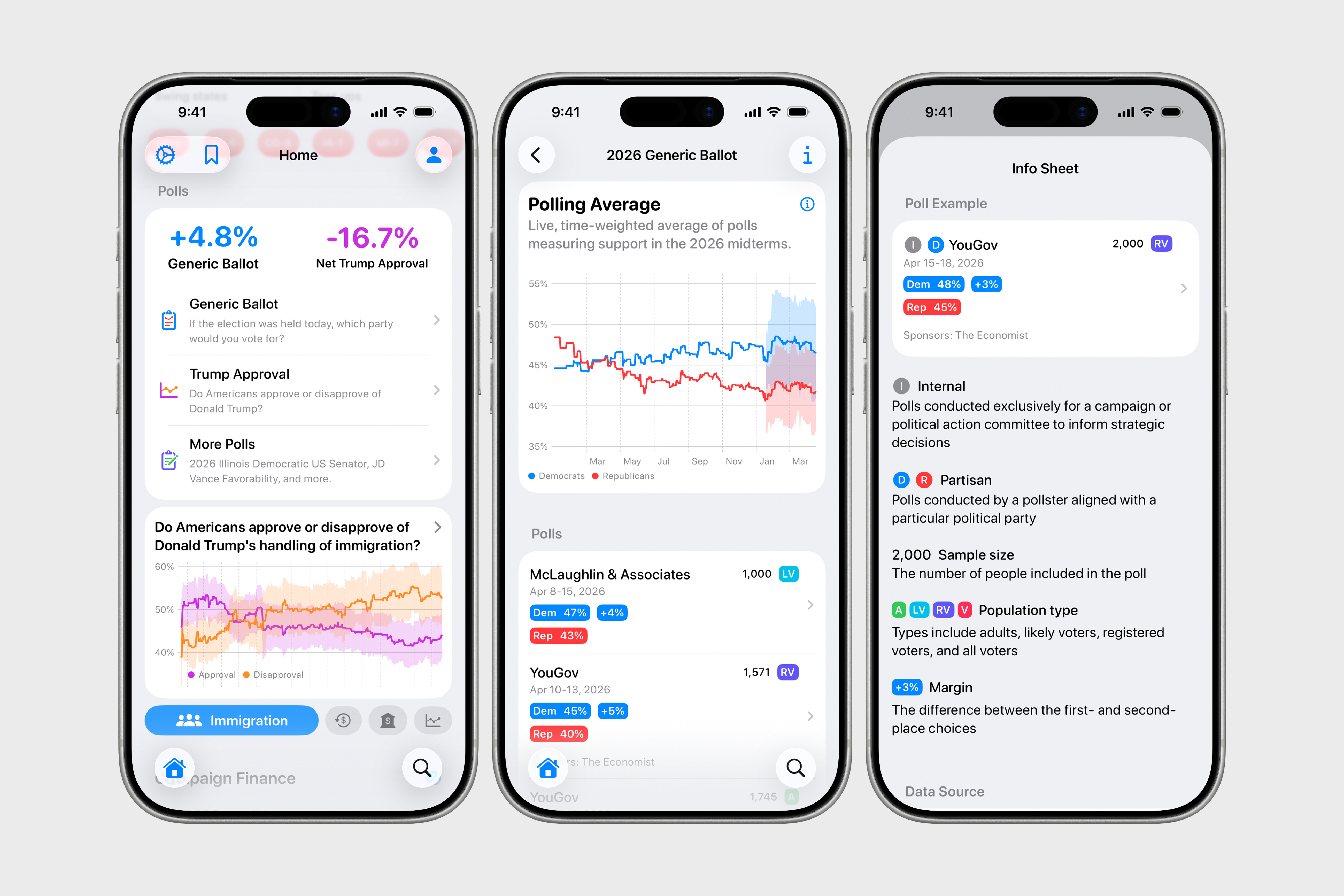
Polls
Polls in Informed mostly come in two types: election polls covering a particular or hypothetical race and approval/disapproval polls covering the current administration and public opinion on certain policies or institutions. The app primarily pulls data from the VoteHub Polling API, which is open and free for "researchers, journalists, and civic-minded developers" (it's great to see other organizations with this mindset!). Using data from Silver Bulletin, the app also has polling data on four major policy areas under the Trump administration: immigration, trade, the economy, and inflation. In addition to individual polls, the app has charts that show a weighted average of polls over time for the generic ballot and presidential approval. These charts are interactive, so users can scrub through them to see the averages for any given day.
Past elections
Lastly, for those interested in historical data, the app has past presidential election results dating back to 2000, showing the national popular vote, Electoral College results, turnout percentage, and the results for each state and county. Here, Apple’s Charts framework is again used extensively to provide a beautiful, clean layout. Eventually, and especially if there's enough interest, I'd like to add midterm and Senate/House results as well. (Side note: past election results typically come in CSV or Excel formats, but it'd be great to have a simple REST API to fetch static JSON)
Data sources & APIs
To a significant degree, Informed can only be as good as the data that powers it, so I'm always on the lookout for new or different data sources and APIs. At launch, Informed uses the following sources and services:
- OpenFEC API for data on elections, candidates, committees, and campaign finance
- Geocodio to convert adresses into Congressional districts
- Inside Elections for race ratings and Baseline data
- The Cook Political Report for Cook PVI data
- Wikipedia for biographical and background information on members of Congress and Congressional districts
- FEC and Census Bureau for past presidential election results and election turnout
- @unitedstates on GitHub for current members of Congress
- Voteview for DW-NOMINATE data for past and current members of Congress
- VoteHub for polls, polling averages, and election forecast data
- civicAPI for live election results
- The Downballot for special election results
Since it's critical that people know where the data they're looking at comes from, data sources are marked throughout the app, and a comprehensive list is provided in the app's settings.
Pricing
At launch, Informed is free without ads of any kind. In the future, I may add an optional in-app subscription (”Informed Pro”) to support features that incur a recurring cost (such as access to data that I will have to pay for annually). In general, I intend to follow a simple pricing philosophy: features and data that are free for me to provide will be free for users, while features and data that cost money will require a small payment to ensure the app is financially sustainable. Users who don’t want or won’t use these “pro” features will never have to pay anything.
I understand app subscription fatigue and that a lot of civic data is already publicly accessible. I hope that my transparency around pricing and data costs makes sense to others, and if you have feedback on these topics, feel free to reach out.
Future directions and roadmap
Informed 1.0 (coming soon) will have, to me, the bare minimum of what a civic and political data tracker should provide: information on elections, campaign finance, polls, candidates, and members of Congress, along with guides and educational resources to make this data accessible and understandable.
But there’s still so much more I’d like to add, starting with making the app more useful and practical. Users should be notified to check the latest polls or campaign contributions to more easily surface trends. The app should help people more quickly connect the dots between industries or wealthy individuals and the candidates campaigning for their vote. They should be able to pull up the largest and most well-funded super PACs and see where their money is coming from and going to. They should be able to quickly and easily share this information with others. And, of course, the app should be as stable and fast as possible.
Some upcoming features I have in mind include:
- More detailed campaign finance data from the FEC, including individual transactions, FEC filings, and data from previous election cycles
- Support for Apple frameworks, including widgets, Siri integration, and app intents
- Sharing to social media, Messages, and other apps
- Copy text to clipboard
- Redistricting data so users understand which districts might change and how this could effect Congress's partisan makeup
Reach out
If you've read this far, thank you. This app is a passion project and labor of love. It's built by one person over years to make exploring civic data fun, easy, and intuitive. You can download the public beta today on TestFlight. For questions, feedback, and feature requests, reach out on Bluesky.